CF #26: Visual ideas, efficiency tools, and creative epiphanies
Key points
Topics
Standing out with motifs
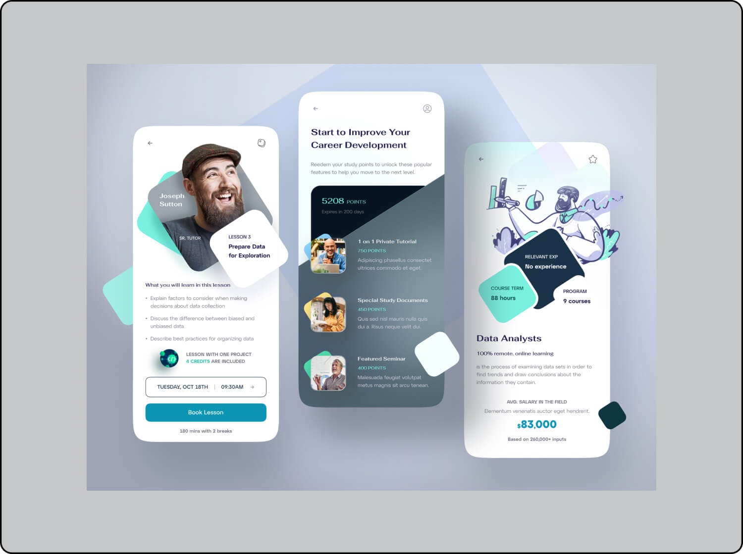
9 eye-catching visual ideas
Pokémon card design lessons
See Ya, Future Me
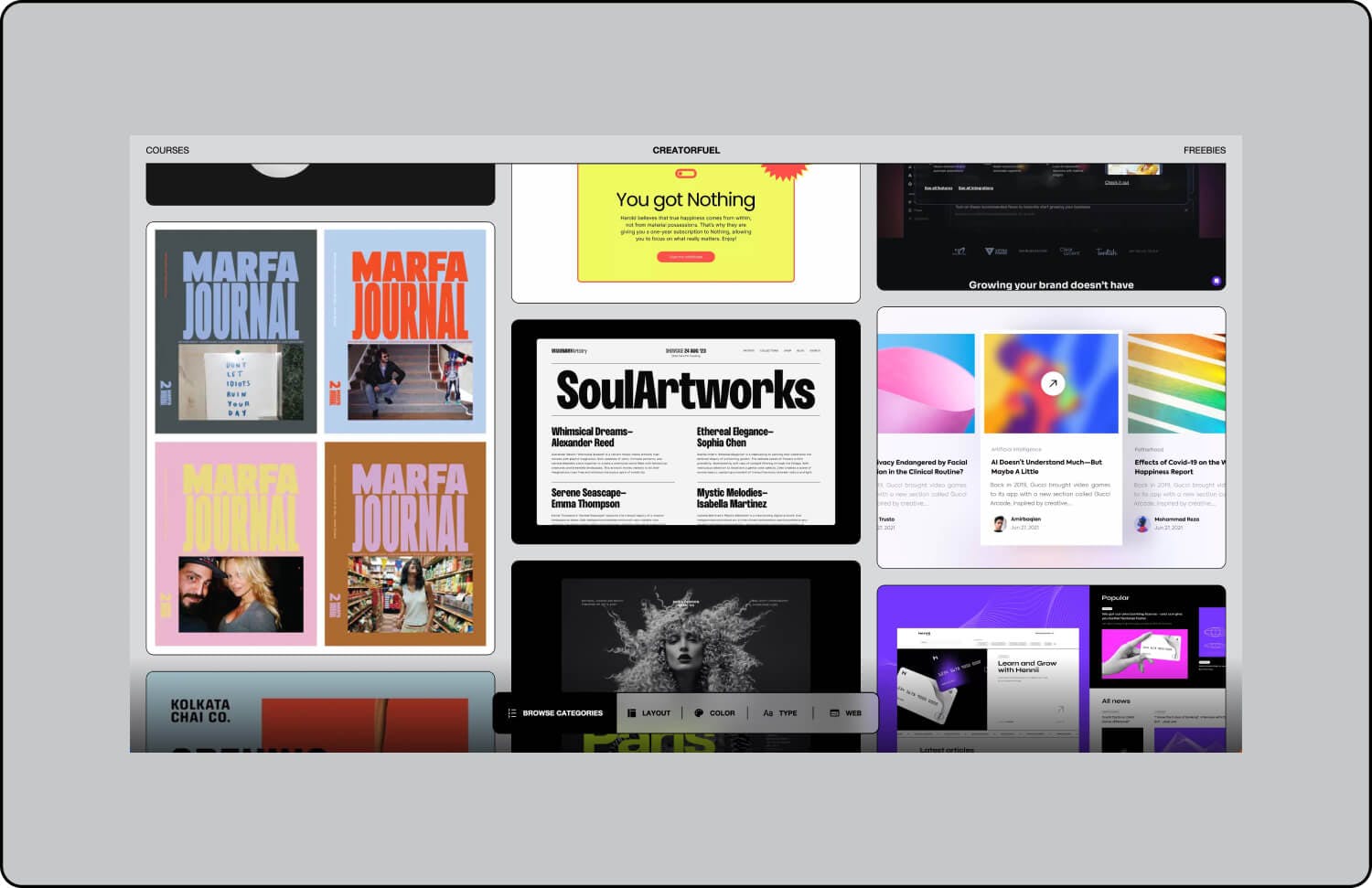
New Inspo Center references
Horo
Inspiration has an expiration date
Humans only have one language processor
10,000 hours vs 10,000 iterations
Standing out with motifs, 9 eye-catching visual ideas, Pokémon card design lessons, See Ya, Future Me, New Inspo Center references, Horo, Inspiration has an expiration date, Humans only have one language processor, 10,000 hours vs 10,000 iterations.
Creatorfuel helps you master high-value skills of the digital era. Learn more.
weekly creatorfuel
Actionable tips & tools for creative minds.
Thank you! Your submission has been received!
Oops! Something went wrong while submitting the form.
“I'm floored by how much content you deliver in these emails. Again, thank you!” -Lindsey O.
weekly redesigns
Learn design through redesigns
Every Tuesday, I redesign something you send me and explain my exact thought process
Thank you! Your submission has been received!
Oops! Something went wrong while submitting the form.
“I'm floored by how much content you deliver in these emails. Again, thank you!” -Lindsey O.
3 tips & tutorials 🌟
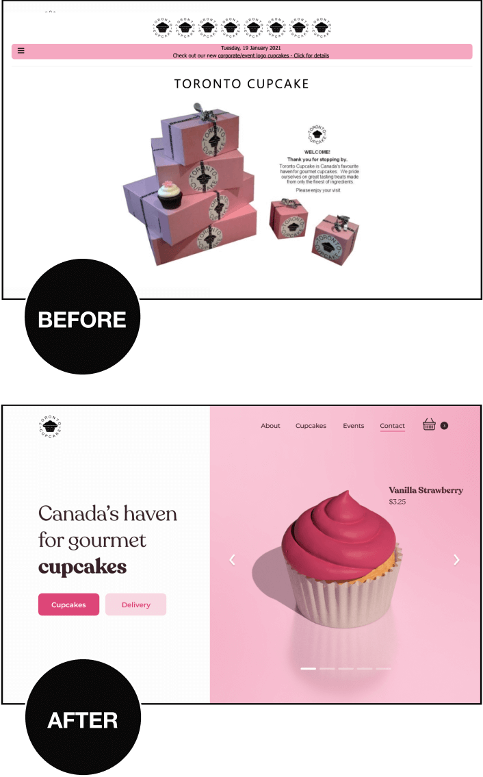
1) Visual charisma: Standing out with ease through motifs
A super easy and effective (yet underutilized) way of giving your visual design a distinct identity is by using a motif.
What's a motif?
A motif is a visual idea that recurs in multiple formats and ties the design together. - Erik D. Kennedy, Learn UI Design
A reflective brushed metal texture introduces a tactile quality and realism to an otherwise 2D element. A beautiful and subtle way of reinforcing the brand motif.
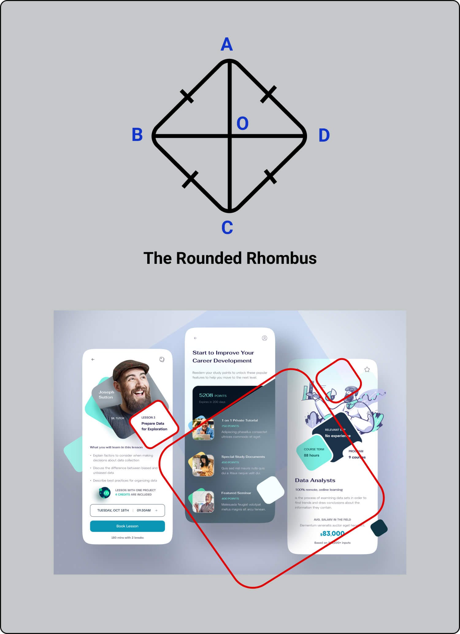
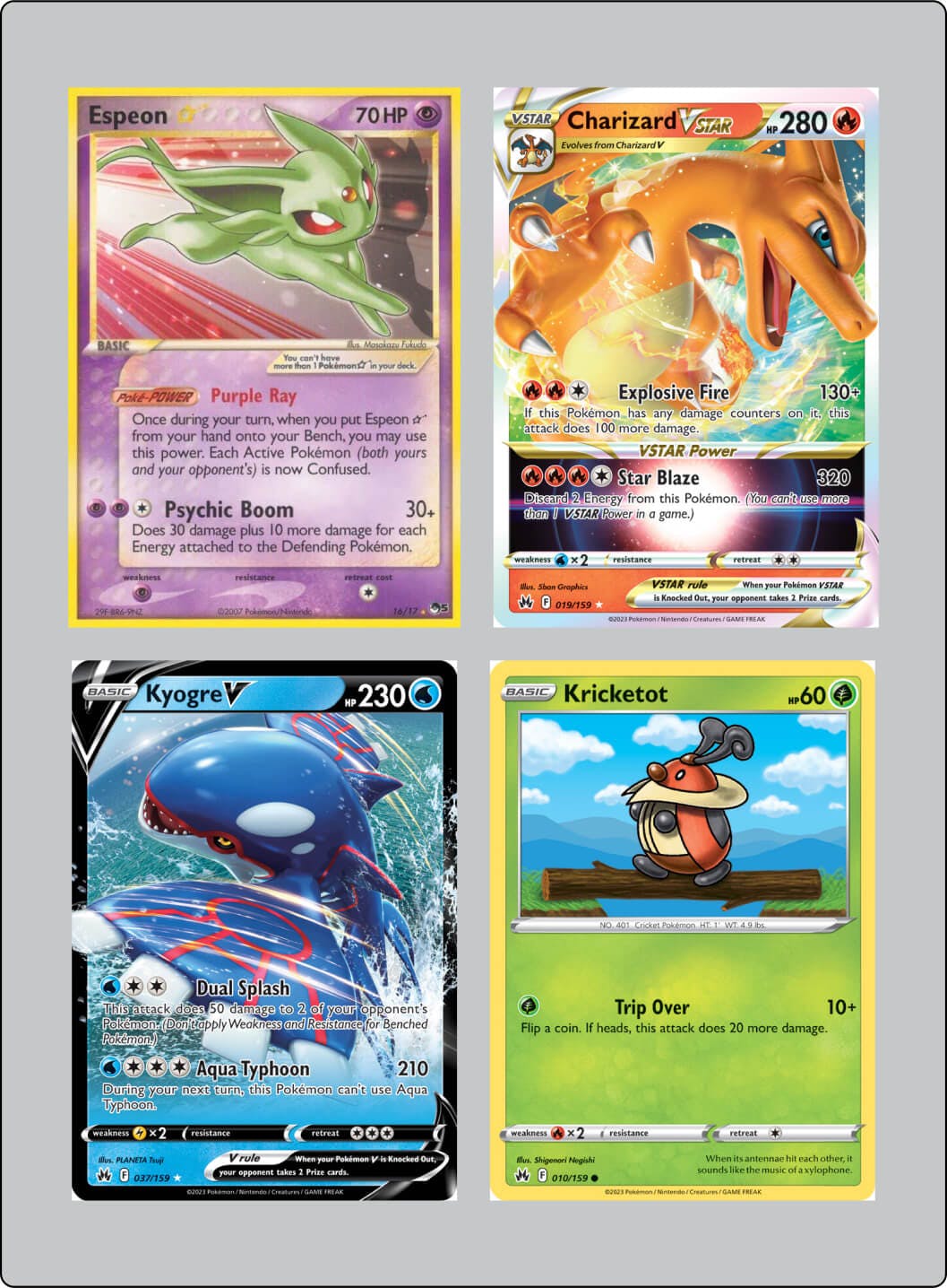
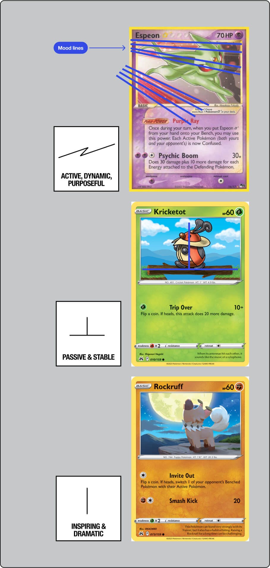
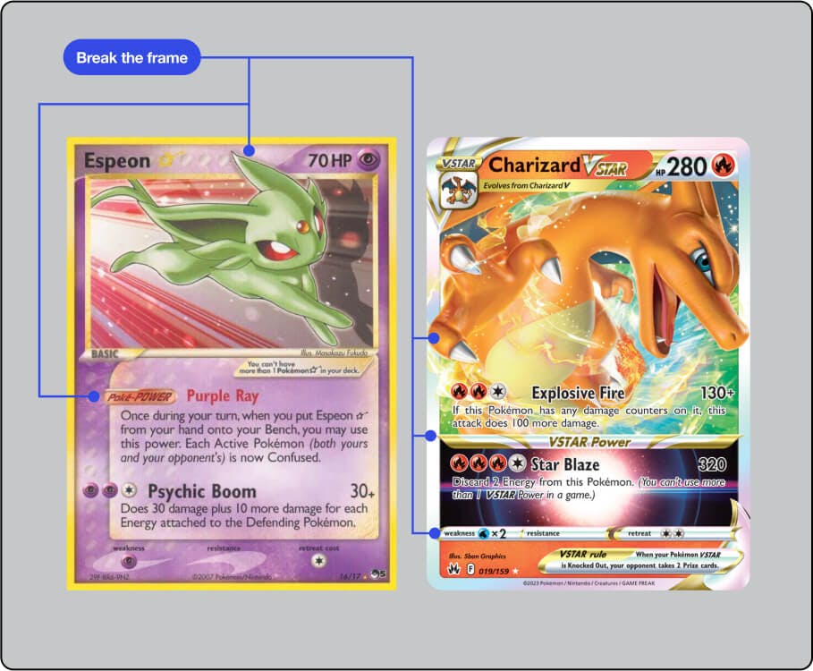
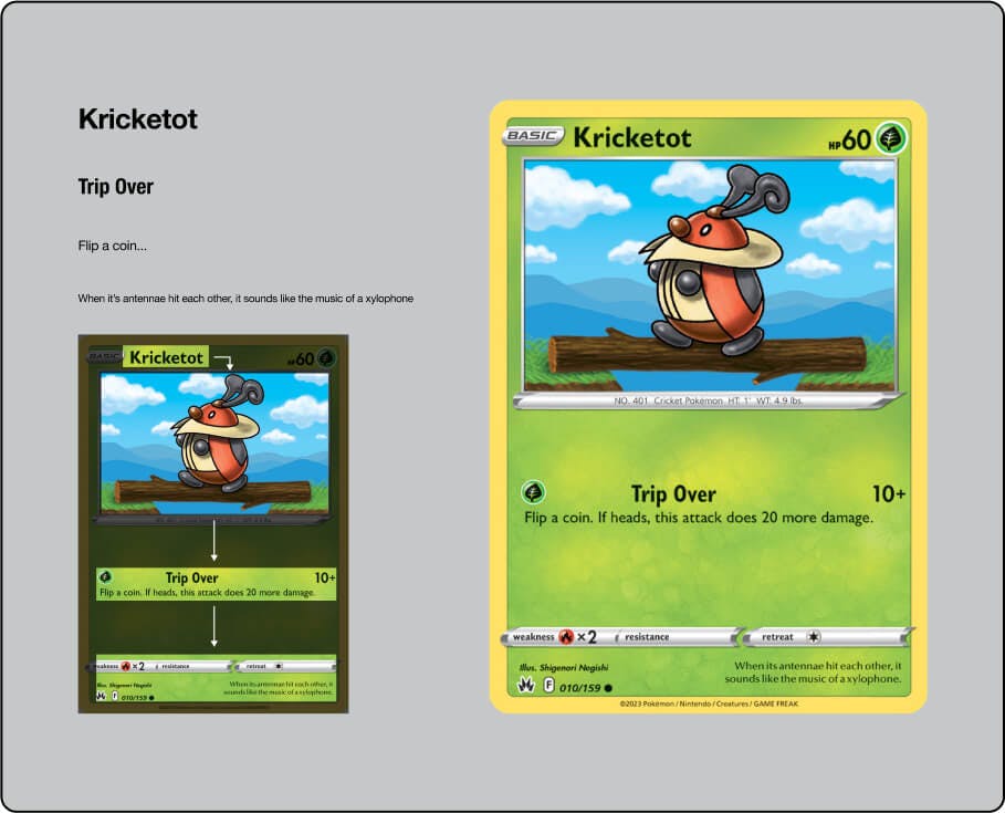
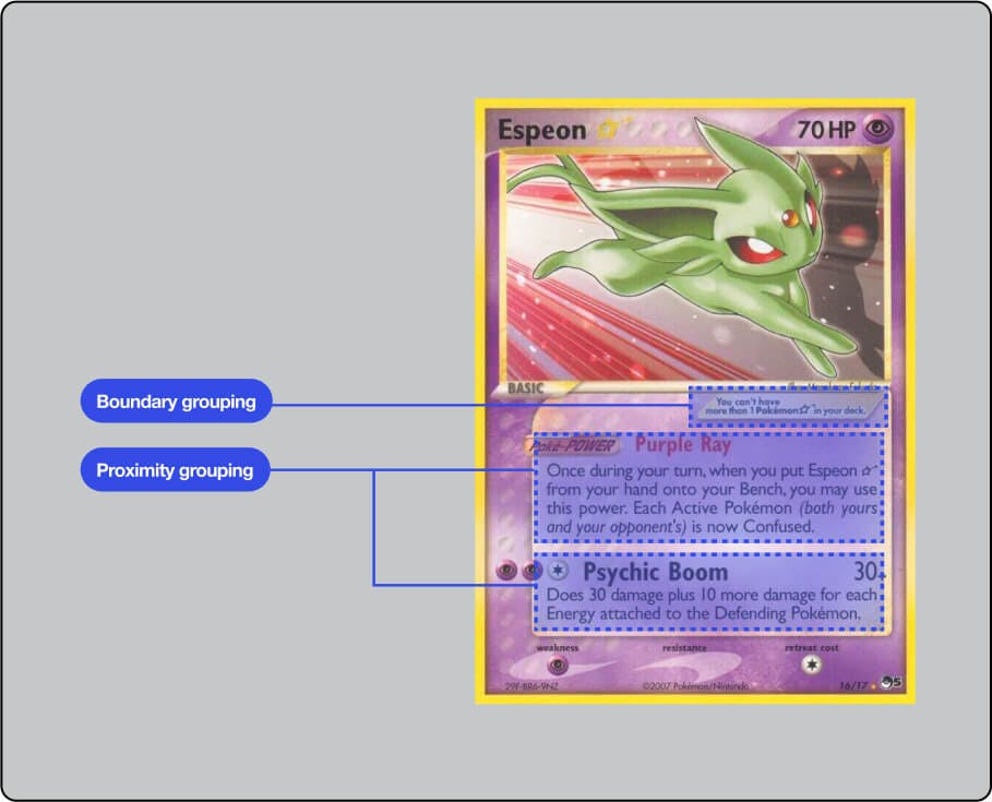
Pokémon cards have been around since 1996 so you can imagine the number of visual ideas Pokémon card designers have had to come up with over the years to keep the cards looking fresh and interesting.
a) Mood lines help convey the essence of the Pokémon:
Bookmark it as I add a few new pieces daily. Enjoy :D
3) Horo
I use Horo to add a time constraint and sense of urgency to my work.
Adding a time constraint gets my butt moving and the creative juices flowin'.
There's something about seeing the Horo timer count down right in my face that yanks the ideas out of me.
Note: I find the timer on the default Clock app to be clunky in comparison. Starting, stopping, and pausing are all inferior. It also doesn't have the natural language engine that I love about Horo.
3 ideas to think about 💡
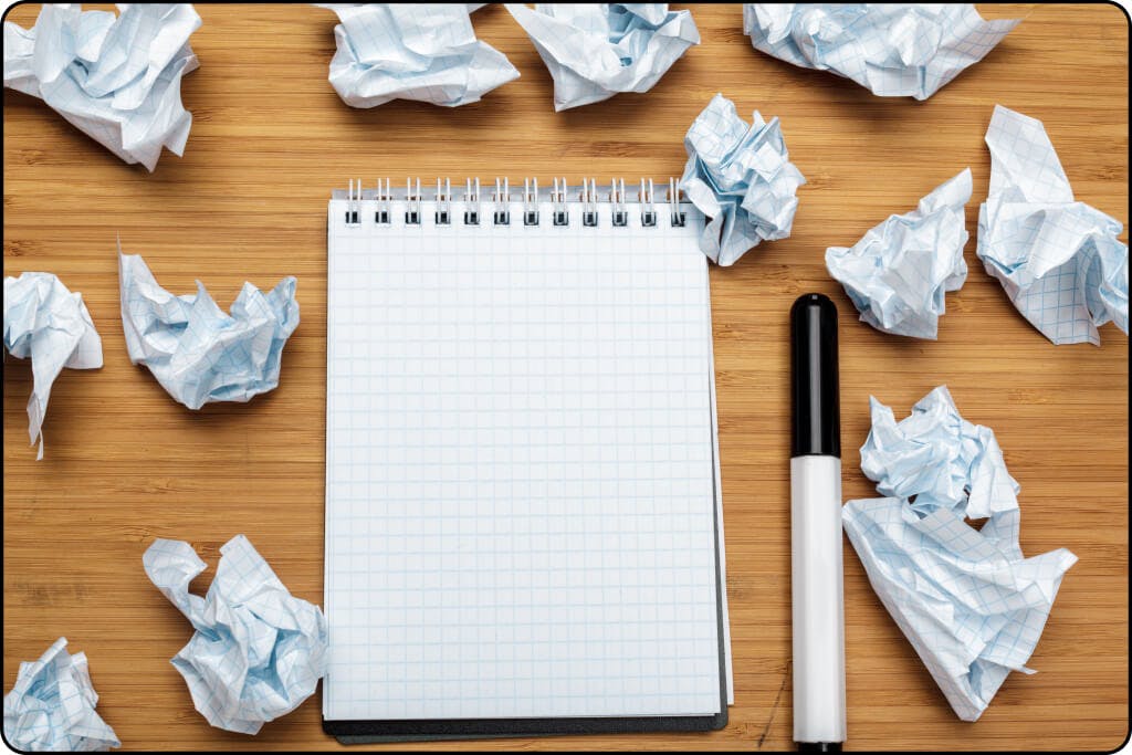
1) Inspiration has an expiration date
You get an incredible idea for a project or initiative.
You're super excited and energized by it.
You can't help but think about how amazingly it'll impact others and how proud you'll be once it's out there.
You then start thinking about how to bring it to life.
"Ouff, damn, quite the big project".
"I'll have to learn this first. Then that".
"I can figure it out but it's gonna take time".
Fear, complexity, and overthinking start setting in.
"I'll get it done soon enough. I have the idea and that's all that matters".
"I have time!"
Truth is, inspiration is perishable. You don't have time.
That initial excitement, passion, and freshness will wane over time.
In fact, if you never actually act on the idea, you'll look back on it later and think: "Wasn't that great of an idea anyway".
Screw all that noise. Act right away.
We must feel the fear and do it anyway (nice little one-liner from Susan Jeffers, Ph.D, that I often recall).
I'm not saying finish executing the idea right away. That's a whole other topic.
I'm saying, start working on it ASAP because that initial passion will give the work a lot of oomph, clarity, and momentum.
Also, the sunk-cost fallacy will minimize the chances you'll give up on it.
You might then say: "I'm a great starter but not the best finisher. How do I finish what I start?"
I’ve learned that no amount of coaching, fancy apps, “creativity hacks & tips” etc, will make up for:
Subpar sleep
Low vitamin D3 (lack of direct sunlight exposure)
Lack of movement (sports, resistance training, cardio)
Poor diet (macro and micronutrients)
Nonexistent stress management
Get these right first.
They are the highest impact things you can do.
Ignoring these is like a student ignoring the fundamental concepts needed to ace an exam and instead focusing on color-coding their notes, using fancy study apps, and organizing their study space with intricate decorations.
Master the basics. Everything else falls into place.
Most nonfiction books should've been 1000-word articles.
I find myself abandoning a lot of books right around the 25-30% mark.
Not because they're bad, but because I fully get the gist by that point and it's right around when the repetition of examples and ideas begins.
I'm okay with abandoning a book midway now. Just a couple years ago, I would power through the whole thing in fear of missing out on some crucial ideas in the later chapters.
Now, I just have fun with it. If it piques my interest, great – I'll buy it, read the chapters that seem interesting, get what I came for and move onto the next one.
I think a lot of these authors are just trying to meet some sort of quota. I dunno.
.png)


.png)