An aesthetically pleasing physical product should be leveraged as an integral focal point of your composition
Before designing any type of layout you must ask yourself: "What do I want viewers to learn and do?"
You can follow the 9-step layout design protocol in this post for any visual design project
Adobe Dimension is great for recreating imagery of physical products when quality photography isn't an option
In this redesign I talk about layout purpose, the entire layout design process, repurposing copy, Adobe Dimension for creating quality mockups, and more...
Creatorfuel helps you master high-value skills of the digital era. Learn more.
weekly creatorfuel
Actionable tips & tools for creative minds.
Thank you! Your submission has been received!
Oops! Something went wrong while submitting the form.
“I'm floored by how much content you deliver in these emails. Again, thank you!” -Lindsey O.
weekly redesigns
Learn design through redesigns
Every Tuesday, I redesign something you send me and explain my exact thought process
Thank you! Your submission has been received!
Oops! Something went wrong while submitting the form.
“I'm floored by how much content you deliver in these emails. Again, thank you!” -Lindsey O.
Lumecor is an Atlanta-based business that sells beautiful luxury candles designed for relaxation.
The candles are handcrafted, eco-friendly and made out of soy and coconut wax. They are paraffin-free (paraffin wax is considered harmful to the environment) and have an 85-hour burn time.
The current website was designed and built in Shopify. Check it out here.
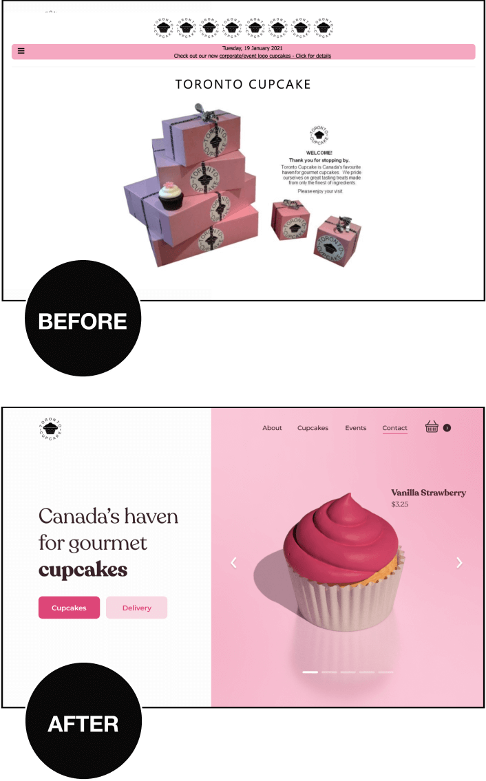
Before
✅ Great color palette and brand assets
Simple and reliable color pair that works with the message (premium luxury candles for relaxation). Black conveys elegance and sophistication while gold creates a feeling of wealth and grandeur.
We have lots to work with.
✅ Aesthetic product
We'll be sure to leverage this by visually emphasizing the product in the hero section to create visceral appeal.
❌ Lacks mood
The composition feels dull and static in terms of balance. The type choice and color application feel unbranded. We'll be sure to add visual interest as well.
❌ Not enough info (feels sketchy)
A good product web page should tell us what we need to know about the product, why we should care, and what we should do next in a graceful step-by-step fashion.
Including about and contact links in this hero section would also be beneficial.
❌ Poor, low-res imagery
This hurts credibility greatly. Your smartphone camera + an appropriate Lightroom edit can go a long way.
❌ Text on image hurts readability
The Redesign
🎯 Goals
Make the following visually prominent: Headline & product differentiators, product shot, link to view the offer(s)
Create a mood (select an appropriate layout style, typeface, color application and visual treatments)
Re-create the product in Adobe Dimension for imagery
⚙️ Process
STEP 1: Identify goals
STEP 2: Research
STEP 3: Prepare the content
STEP 4: Rough layouts / sketching
END OF PHASE 1 -> Get feedback
STEP 5: Define the mood
STEP 6: Collect visual ideas (moodboard)
STEP 7: Apply visual ideas
I like this black background being lit by candles.
I love the classical proportions of this typeface (while also slightly contemporary)
The gold text emphasis adds visual interest + makes use of brand colors
We could just separate the navigation with white space but I think a white divider adds a touch of flair ;)
Other ideas I tried:
END OF PHASE 2 -> Get feedback
STEP 8: Pick a spatial system and setup grid
A spatial system = your layout's rules
It all starts by picking a base number and letting all sizing and spacing be multiples of that base number. The layout below follows an 8pt system (I picked 8 as my base unit).
Notice how all the sizing and spacing numbers are multiples of 8?
32, 64, 224 are all divisible by 8.
This creates visual rhythm, creates consistency within the layout and removes any guessing on your end as a creator.
STEP 9: Layout efficacy checklist
END OF PHASE 3 -> Get feedback
Create product shot in Adobe Dimension
Couldn't find a good product shot on the current site so I jumped into AD and tried to reproduce it with some dim lighting.
Setup logo
I took a screenshot of their IG profile picture (their logo) and used the “Image Tracer” Figma plugin to convert it into a an SVG that I can manipulate.
Steal copy from IG account for headline
weekly creatorfuel
I share tips & tools every creator should know.
Thank you! Your submission has been received!
Oops! Something went wrong while submitting the form.
“I'm floored by how much content you deliver in these emails. Again, thank you!” -Lindsey O.
weekly redesigns
Learn design through redesigns
Every Tuesday, I redesign something you send me and explain my exact thought process
Thank you! Your submission has been received!
Oops! Something went wrong while submitting the form.
“I'm floored by how much content you deliver in these emails. Again, thank you!” -Lindsey O.
I’ve learned that no amount of coaching, fancy apps, “creativity hacks & tips” etc, will make up for:
Subpar sleep
Low vitamin D3 (lack of direct sunlight exposure)
Lack of movement (sports, resistance training, cardio)
Poor diet (macro and micronutrients)
Nonexistent stress management
Get these right first.
They are the highest impact things you can do.
Ignoring these is like a student ignoring the fundamental concepts needed to ace an exam and instead focusing on color-coding their notes, using fancy study apps, and organizing their study space with intricate decorations.
Master the basics. Everything else falls into place.
Most nonfiction books should've been 1000-word articles.
I find myself abandoning a lot of books right around the 25-30% mark.
Not because they're bad, but because I fully get the gist by that point and it's right around when the repetition of examples and ideas begins.
I'm okay with abandoning a book midway now. Just a couple years ago, I would power through the whole thing in fear of missing out on some crucial ideas in the later chapters.
Now, I just have fun with it. If it piques my interest, great – I'll buy it, read the chapters that seem interesting, get what I came for and move onto the next one.
I think a lot of these authors are just trying to meet some sort of quota. I dunno.
.png)


.png)
.jpg)
.jpg)
.jpg)
.jpg)
.jpg)
.jpg)
.jpg)
.jpg)
.jpg)
.jpg)
.jpg)
.jpg)
.jpg)


.jpg)
.jpg)
.jpg)
.jpg)
.jpg)


