Hero image positioning should take into account foreground elements and strategically contribute to the overall message
Avoid redundant textual content
Keeping your visual language "modern" shows viewers that your brand is progressive, professional and current
Ample side-margins "frame" content with white space which helps viewer focus
Breaking the frame with imagery is an easy way of adding tons of visual interest and depth to a layout
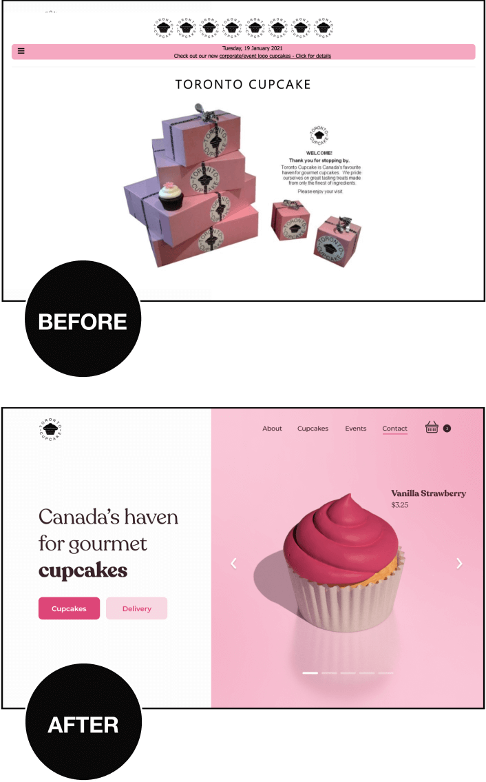
In this redesign, we discuss the importance of hero image resolution & positioning, current visual language, line-length, internal consistency and much more.
Creatorfuel helps you master high-value skills of the digital era. Learn more.
weekly creatorfuel
Actionable tips & tools for creative minds.
Thank you! Your submission has been received!
Oops! Something went wrong while submitting the form.
“I'm floored by how much content you deliver in these emails. Again, thank you!” -Lindsey O.
weekly redesigns
Learn design through redesigns
Every Tuesday, I redesign something you send me and explain my exact thought process
Thank you! Your submission has been received!
Oops! Something went wrong while submitting the form.
“I'm floored by how much content you deliver in these emails. Again, thank you!” -Lindsey O.
I'll be redesigning the homepage hero section for a moving company called Top Moving Solutions that helps Nashville-based clients who need experienced movers for a complete hands-off moving experience.
Top Moving Solutions has been in business for 13 years and take care of both residential & commercial moves.
The current site was built in WordPress. Check it out here.
Before
✅ Prominent call-to-action (clear next steps)
They leveraged scale to make next steps crystal clear and direct. Once the user trusts the brand, there will be no confusion as to what action to take (underrated move).
✅ Dark translucent layer to help contrast and readability
✅ Plenty of pertinent trust-building information immediately accessible
Potential clients are going to want to learn more about the business, who's behind it, who's used it, the services offered etc.
❌ Odd positioning & crop of hero image
The overly zoomed-in crop makes the contents of the image indiscernible preventing it from adding to the overall message, look & feel.
❌ Pixelated hero image
Viewers subconsciously view the quality of your offer to be directly proportional to the quality of your website. High-res imagery helps reassure potential clients that your offer/service will involve great attention to detail.
❌ Redundant/recurrent textual content
What does repeating the company name in the headline, logo, and background image add to the overall message of convincing viewers to become clients? Design is utilitarian. Even the more visceral elements/decisions of a layout serve a unique purpose. You're better off making good use of every single element in a layout.
❌ Dated visual language (lacks identity)
When poorly executed, an old-fashioned visual language may scare off potential clients as they may suspect the company is either defunct or sloppy. A progressive brand that keeps with the times will always outperform one that is not current about their digital presence (when all else is equal).
❌ Excessive line-length & letter-spacing
Extra long line-lengths and letter-spacing force our eyes to make more exaggerated eye movements (it's more work). In this case, our eyes start at one edge of the screen and read until the opposite edge. The letter-spacing also makes it ever so slightly harder to piece together characters in order to recognize words.
It's just a distance thing.
Textual content that is compact is typically easier to consume.
❌ No clear visual pecking order of elements
When a layout contains multiple elements that have the same visual weight, what typically happens is disorientation. When everything is important, nothing is important, which leads to paralysis by analysis. Too many closely positioned elements fighting for our attention prevents us from smoothly navigating the layout.
Check visual weight by blurring the layout and seeing the degree to which things stick out.
❌ Button text contrast is poor
That button copy gets completely lost inside that light sky blue button. The brightness difference between white (the text color) and the button's light sky blue just isn't pronounced enough.
❌ Lack of internal consistency (buttons & typography)
Internal consistency = your layout's unique rules. In this case, a light blue button with dark blue text could be the secondary button style, while a dark blue button with white text could be the primary button style.
Communication goals: Build trust, service area(s), contact CTA
Desired results: 20% clickthrough rate to offer
STEP 2: Research
STEP 3: Prepare the content
STEP 4: Rough layouts / sketching
Reviews, phone number, and socials all easily accessible and prominent given that they are surrounded with white space. This helps build trust. Coupon should be a pop-up or slide-in form.
Humanize the brand and make it feel more approachable by showing your movers. I found this image of one of your team members in your website gallery which I thought was fantastic.
Punchy, confident headline. Subhead mentions location.The company name is already conveniently descriptive (Moving Solutions)
END OF PHASE 1: Get feedback
STEP 5: Define the mood
MOOD STATEMENT:
This is a homepage hero section for a moving company brand that helps Nashville-based individuals & businesses who need to pack &relocate their goods without lifting a finger. This layout needs to feel:
Approachable
Trustworthy
Dependable
Friendly
Caring
VISUAL ELEMENTS TO CONSIDER BASED ON THE ABOVE:
Balance
Symmetrical or asymmetrical
Typeface
Sans-serif with gentle curves that balances sophistication and friendliness
Colors
White (Simplicity, openness, clarity, hope)
Blue (Trust, security, responsibility)
Potential visual treatments
Imagery that breaks the frame
Slightly rounded corners
STEP 6: Create moodboard (collect visual ideas)
STEP 7: Apply visual ideas
The current background image feels a little too raw and unrefined, let's replace it with some color for now and add imagery later.
I love how calm and approachable this yellow feels. We're going to steal it and just change the hue (H value) to our blue.
I like the idea of having a truck backed into the layout with some boxes.
So, I found a stock image of a similar truck, isolated the background, added a shadow and the company’s logo
There's quite a bit going on in this layout so I think adding side-margins to the imagery can help viewers more easily focus on the content.
As is, the layout isn't balanced. The headline font is too light. We need something chunkier to match the weight of the imagery on the right side.
I went with Inter Black and added some finishing touches.
END OF PHASE 2: Get feedback
STEP 8: Pick a spatial system and setup grid
Now that we know how our content falls on the canvas and we’ve settled on a layout and mood, we can align, size and space elements accurately to clean things up and create sizing and spacing rules for our layout.
We do this by establishing a spatial system.
A spatial system = your layout's sizing & spacing rules
This creates visual rhythm, creates consistency within the layout and removes any guessing on your end as a creator.
It all starts by picking a base number and letting all sizing and spacing be multiples of that base number. The layout below follows an 8pt system (I picked 8 as my base unit).
Notice how all the sizing and spacing numbers are multiples of 8?
32, 64, 224 are all divisible by 8.
8pt is the most popular because it’s an even number meaning you won’t be splitting pixels when centering elements and it gives you a reasonable amount of sizing options (8, 16, 24, 32, ) that are distinct enough
A smaller base unit like 4pt gives you more options. Do you need the extra spacing/sizing options? (4, 8, 12, 16, 20, 24, 28, 32, 36, 40, 44, 48 etc etc)
A bigger base unit like 16pt gives you fewer options and the sizing and spacing differences may be too big (16, 32, 48, 64, 80, 96)
An odd number like 7 means you’ll be splitting pixels when centering elements which can be detrimental for aligning further elements
STEP 9: Layout efficacy checklist
END OF PHASE 3: Get feedback
weekly creatorfuel
I share tips & tools every creator should know.
Thank you! Your submission has been received!
Oops! Something went wrong while submitting the form.
“I'm floored by how much content you deliver in these emails. Again, thank you!” -Lindsey O.
weekly redesigns
Learn design through redesigns
Every Tuesday, I redesign something you send me and explain my exact thought process
Thank you! Your submission has been received!
Oops! Something went wrong while submitting the form.
“I'm floored by how much content you deliver in these emails. Again, thank you!” -Lindsey O.
I’ve learned that no amount of coaching, fancy apps, “creativity hacks & tips” etc, will make up for:
Subpar sleep
Low vitamin D3 (lack of direct sunlight exposure)
Lack of movement (sports, resistance training, cardio)
Poor diet (macro and micronutrients)
Nonexistent stress management
Get these right first.
They are the highest impact things you can do.
Ignoring these is like a student ignoring the fundamental concepts needed to ace an exam and instead focusing on color-coding their notes, using fancy study apps, and organizing their study space with intricate decorations.
Master the basics. Everything else falls into place.
Most nonfiction books should've been 1000-word articles.
I find myself abandoning a lot of books right around the 25-30% mark.
Not because they're bad, but because I fully get the gist by that point and it's right around when the repetition of examples and ideas begins.
I'm okay with abandoning a book midway now. Just a couple years ago, I would power through the whole thing in fear of missing out on some crucial ideas in the later chapters.
Now, I just have fun with it. If it piques my interest, great – I'll buy it, read the chapters that seem interesting, get what I came for and move onto the next one.
I think a lot of these authors are just trying to meet some sort of quota. I dunno.
.png)


.png)
.jpg)
.jpg)


.jpg)


.jpg)


