New categorized inspiration resource built by yours truly (inspo for layout, color, type and more)
Insert Big Image and Image Tracer are two nifty Figma plugins that I'm sure will speed up your workflow
Humans don't read. They scan. They quickly glance at the most prominent elements: Headings, imagery, lists, tables, highlighted text, and more
Many designers suffer from the Status Quo Bias making it hard to detach themselves from their work and be objective and rational about new information to improve
Other designers act too hastily, making changes left and right without proper contextualization, thinking, or collecting more data
When asking for feedback, ask non-biasing questions. Meaning, formulate your questions so that they do not lead the listener towards the answer you may want to hear
Experience does not equal competence. Apply your learnings well and continually identify what to improve on.This way it takes mere months to put yourself in the top 10% of anything, skill-wise
A categorized design inspiration resource built by yours truly, some nifty Figma plugins, how humans scan layouts, and more
Creatorfuel helps you master high-value skills of the digital era. Learn more.
weekly creatorfuel
Actionable tips & tools for creative minds.
Thank you! Your submission has been received!
Oops! Something went wrong while submitting the form.
“I'm floored by how much content you deliver in these emails. Again, thank you!” -Lindsey O.
weekly redesigns
Learn design through redesigns
Every Tuesday, I redesign something you send me and explain my exact thought process
Thank you! Your submission has been received!
Oops! Something went wrong while submitting the form.
“I'm floored by how much content you deliver in these emails. Again, thank you!” -Lindsey O.
I had a messy Figma file full screenshots of good design that I had accumulated and categorized over the years.
The screenshots were categorized using pages as you can see below.
I thought "why not make this public? It's useful to me. It might be useful to someone else?". Aaaand this thing was born.
The categories:
Layout
Color
Typography
Imagery
Good UX (Coming soon)
3D
Copywriting (I can appreciate great writing)
Web design
There are a little over 200 items so far. I'm still transferring items over.
I add a couple everyday.
Bookmark it, share it with your friends, your dog, your gym partner, your goldfish.
In all seriousness, feel free to reference it whenever you're in the creative phase of a project and need inspiration.
I built this in Webflow in case you were wondering. Reply to this email if you're a fellow Webflow lover and you want to know how it's set up.
2) Insert Big Image (Figma plugin)
I'm sure you've run into the scenario of bringing a big image into Figma (like a tall screenshot of a website) only to have Figma compress the heck out of it, turning it into a pixelated mess.
Image Tracer converts JPGs and PNGs into scalable vectors.
Maybe you want to quickly turn a blurry image into a vector that you can manipulate to your heart's content. Or maybe you're working on a web project and the only logo asset the client has is a pixelated JPG.
3 Effective Tips
1) How Humans View Layouts
You've probably heard: People don't read. They scan.
All the little decorative elements and lengthy well-thought-out body text you added. Yeah, very few actually noticed or read any of that.
People quickly glance over a layout in pursuit of information that is relevant to them in that precise moment.
Because humans are naturally efficient, they will attempt to attain their goal with the least amount of effort possible.
Here's what people actually look at when they're scanning:
Headings
Highlighted text
Non-decorative imagery (Show, don't tell)
Bulleted lists
Tables
The first few words of a paragraph
Large, high-contrast shapes
Highly isolated elements
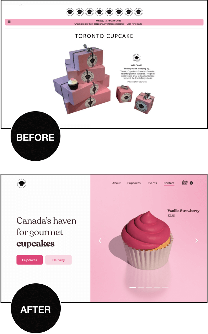
Here's an example of what a viewer might notice upon first scan of a website homepage:
mysweetdreams.co
Why is this important?
1) Now you know what elements are crucial to making a layout scannable (Headings, lists, descriptive imagery, etc.)
2) You can ensure that your most critical information is found in those elements.
2) How Designers Make Bad Decisions
It's all well and good to talk about the psychological biases of people who view layouts, but what about the biases that the creators of said layouts (designers) are vulnerable to?
Yes, you as a designer are also vulnerable to cognitive biases that may negatively impact your design choices.
Let's talk about it.
a)Anchoring Bias / Status Quo Bias: A cognitive bias that leads us to place too much weight on the first piece of information we are given about a subject.
Maybe you're too attached to the first iteration of a design.
Perhaps you learn something new about your target audience and the Anchoring Bias makes it hard for you to change your opinion and make the appropriate modifications.
Do this: Try not to fall in love with the first thing you create or learn. Be objective about new information and act rationally.
b) On the flip side, resist the urge to make hasty snap decisions without enough information or enough thought. This is called FOMO. The Fear of Missing Out on an opportunity.
Say you launch a new mobile app and ONE user complains about a certain part of the design.
Many designers will experience FOMO in this situation and immediately call for an update to the design.
Do this: Prevent yourself from seeing everything as an opportunity. Stop, contextualize, think, collect more data and then decide.
c) As a creator/designer, you'll often ask people for feedback.
Ask non-biasing questions!
The way you formulate your question is so incredibly important.
Example:
Bad:
Was everything clear during the sign-up process or was the third step a little confusing?
Try not to lead the person towards the answer you want to hear. Most people want to be nice and agree with you.
Good:
Was everything clear during the sign-up process?
3) Does Experience = Competence?
You can do something over and over for years and still have huge skill gaps.
I experienced this. I'm stubborn and like to go my own way. It's a massive waste of time.
It's not about how often you learn or practice.
It's about what you learn, how well you apply it and your ability to continually identify what to improve on.
When done with intention, it takes mere months, or even weeks of dedication to put yourself in the top 10% of anything skill-wise.
Some succumb to the Overconfidence Effect. You think you know everything and you place too much weight on the first pieces of information you were given about a subject. You stagnate. Plain and simple.
Others succumb to Underconfidence. Never taking action or attempting something new means they never create and mess up something real which is essential for development.
Just try to look at yourself objectively and have fun. It's not that serious.
3 Ideas to Think About
1) Friendly reminder to make sure that your daily efforts align with your medium and long term goals.
Bonus reminder: If you feel resistance or anxiety to do something (and that thing may be good for your evolution), that means you NEED to do that thing.
2) There is no such thing as minimalism. There is only good design as a result of knowing your audience.
Know your audience and what they seek
⬇
Avoid content-dumping and over-designing
⬇
Only provide what you know the viewer needs
3) Like a brick wall, a layout is two-fold:
Bricks = Design elements → text, images, shapes etc.
Cement = The strategies that organize these elements → alignment, visual hierarchy, grouping etc.
Shower thoughts
1) You've probably done something habitually that a stranger has noticed, thought was cool, and tried to emulate
2) In the span of half a century, we went from cars that have neither cassette players nor CD players, to cars that have cassette players, to cars that have CD players, and then back to cars that have neither
3) The larger the download button the sketchier it seems
Via Reddit Showerthoughts
weekly creatorfuel
I share tips & tools every creator should know.
Thank you! Your submission has been received!
Oops! Something went wrong while submitting the form.
“I'm floored by how much content you deliver in these emails. Again, thank you!” -Lindsey O.
weekly redesigns
Learn design through redesigns
Every Tuesday, I redesign something you send me and explain my exact thought process
Thank you! Your submission has been received!
Oops! Something went wrong while submitting the form.
“I'm floored by how much content you deliver in these emails. Again, thank you!” -Lindsey O.
I’ve learned that no amount of coaching, fancy apps, “creativity hacks & tips” etc, will make up for:
Subpar sleep
Low vitamin D3 (lack of direct sunlight exposure)
Lack of movement (sports, resistance training, cardio)
Poor diet (macro and micronutrients)
Nonexistent stress management
Get these right first.
They are the highest impact things you can do.
Ignoring these is like a student ignoring the fundamental concepts needed to ace an exam and instead focusing on color-coding their notes, using fancy study apps, and organizing their study space with intricate decorations.
Master the basics. Everything else falls into place.
Most nonfiction books should've been 1000-word articles.
I find myself abandoning a lot of books right around the 25-30% mark.
Not because they're bad, but because I fully get the gist by that point and it's right around when the repetition of examples and ideas begins.
I'm okay with abandoning a book midway now. Just a couple years ago, I would power through the whole thing in fear of missing out on some crucial ideas in the later chapters.
Now, I just have fun with it. If it piques my interest, great – I'll buy it, read the chapters that seem interesting, get what I came for and move onto the next one.
I think a lot of these authors are just trying to meet some sort of quota. I dunno.
.png)


.png)