CF #21: Summarizing & illustrating every single layout design strategy
Key points
Topics
Master these layout principles and you'll be an unstoppable layout designer: Grids & alignment, sizing & spacing, visual hierarchy, grouping, consistency, scannability, balance, aesthetics, mood
Use Stark inside your favourite interface design tool to fix any and all accessibility issues (color contrast, type, visual simulations and more!)
We should all have a brain-dump journal. Empty your mind into the real world. This makes your thoughts tangible and easier to navigate.
Briefly but effectively summarizing (and showing) every single layout principle, my favorite all-in-one accessibility tool, brain-dump journalling, and more
Creatorfuel helps you master high-value skills of the digital era. Learn more.
weekly creatorfuel
Actionable tips & tools for creative minds.
Thank you! Your submission has been received!
Oops! Something went wrong while submitting the form.
“I'm floored by how much content you deliver in these emails. Again, thank you!” -Lindsey O.
weekly redesigns
Learn design through redesigns
Every Tuesday, I redesign something you send me and explain my exact thought process
Thank you! Your submission has been received!
Oops! Something went wrong while submitting the form.
“I'm floored by how much content you deliver in these emails. Again, thank you!” -Lindsey O.
1 Effective Tip
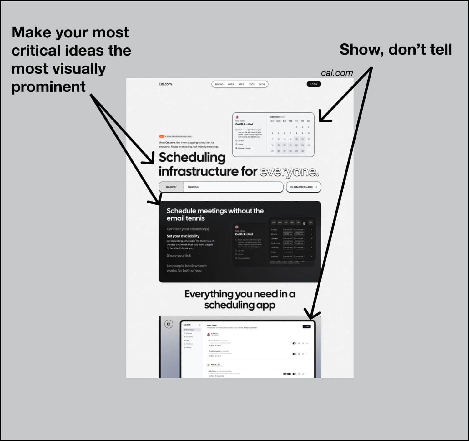
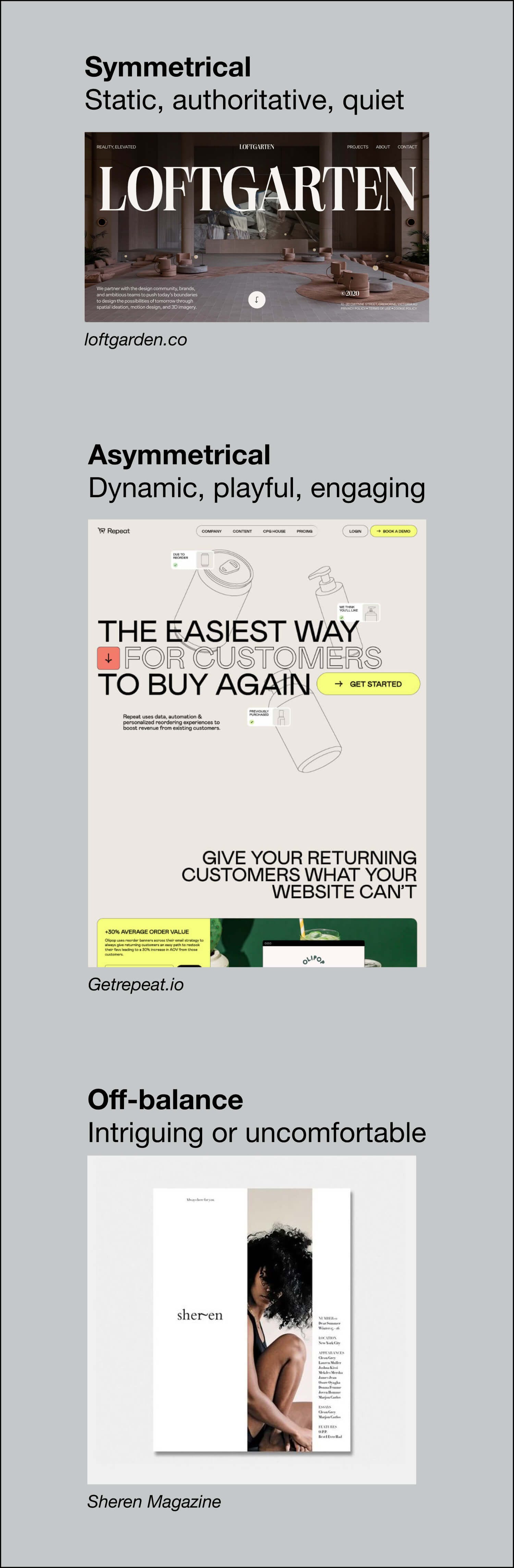
Summarizing every single layout strategy you need to know
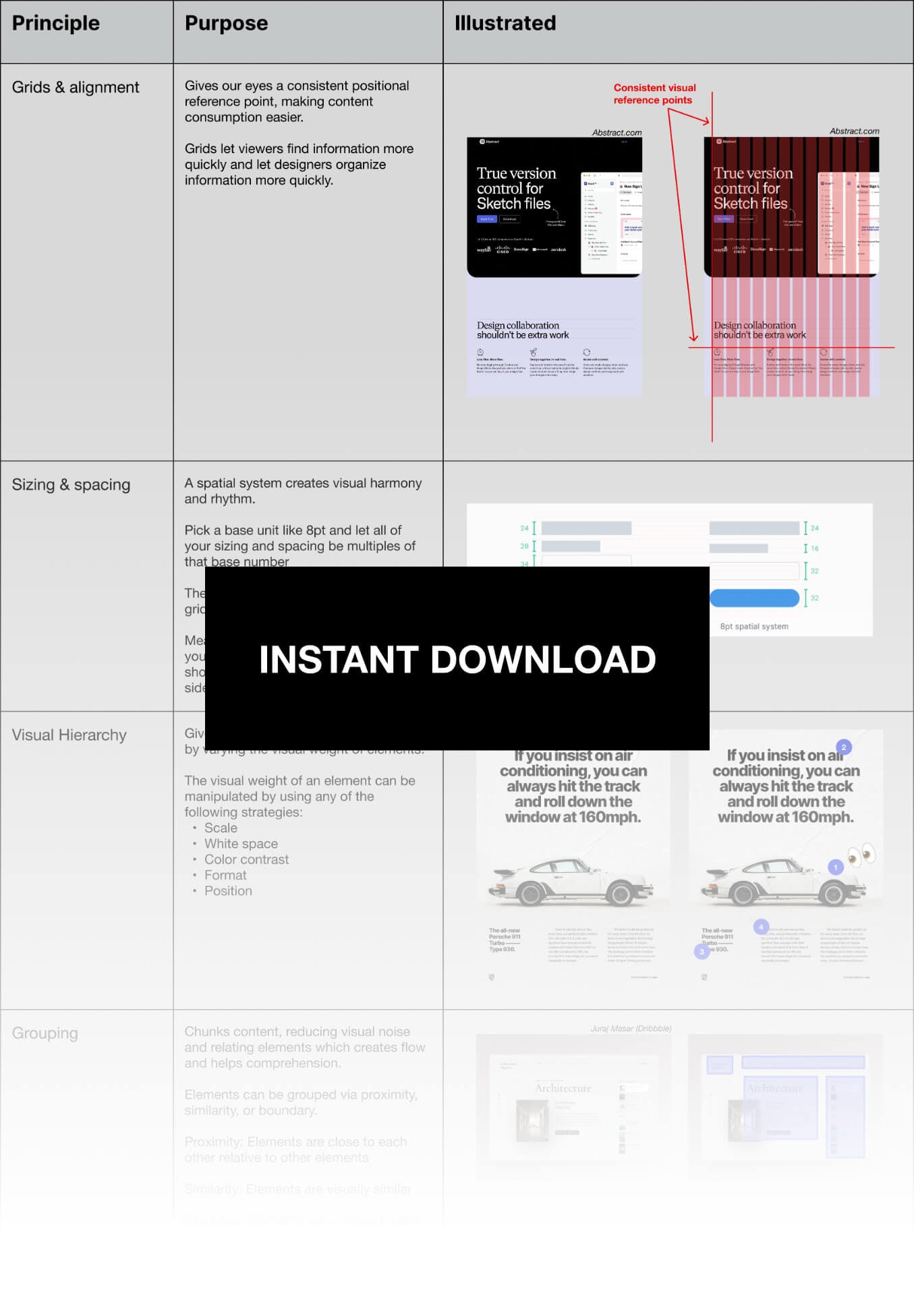
Grids & Alignment
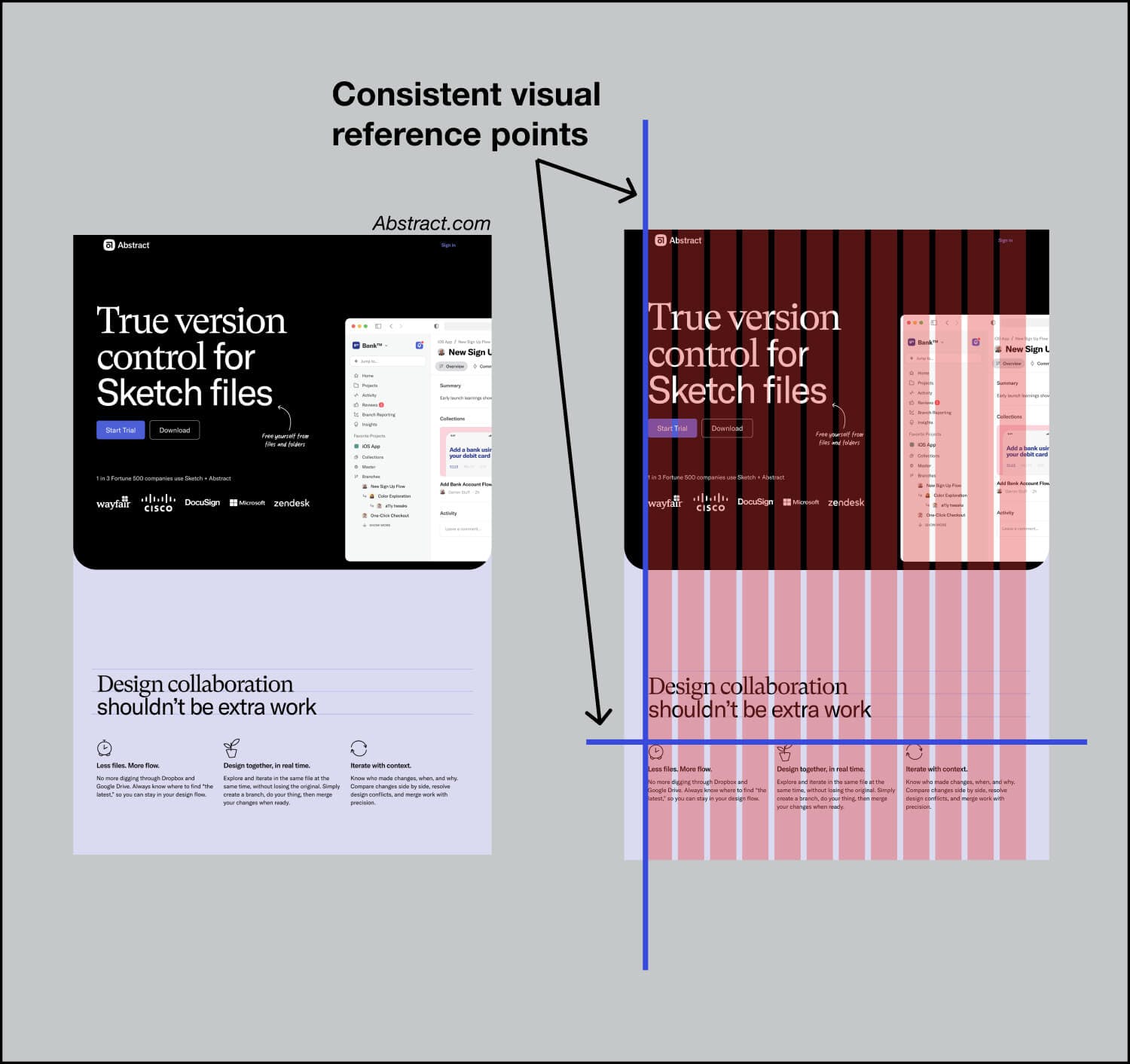
Alignment gives our eyes a consistent positional reference point, making content consumption easier.
Grids let viewers find information more quickly and let designers organize information more quickly.
A spatial system creates visual harmony and rhythm.
Pick a base unit like 8pt and let all of your sizing and spacing be multiples of that base number.
The spatial system also applies to the grid’s spacing parameters.
Meaning, if you pick a base unit of 8pt, your grid’s side-margins and gutters should be any multiple of 8 (e.g. 72 for side-margins and 24 for gutters).
Makes a layout predictable and easier to visually and functionally navigate.
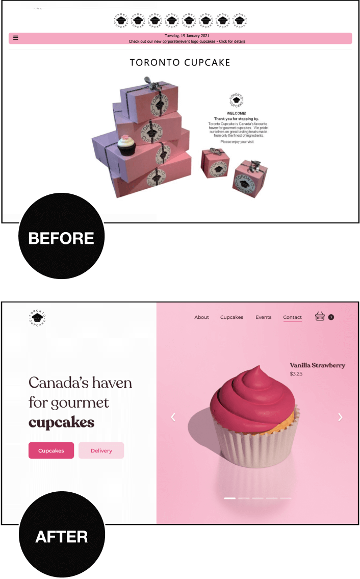
This also means less decision-making for creators since there's one agreed-upon source of truth for both that layout (internal consistency) and for that type of layout (external consistency).
Both internal and external consistency are important.
Internal consistency = Uniformity within the layout
Over 200 inspo pieces neatly organized in the following categories:
Layout
Color
Typography
Web design
Copywriting
Imagery
3D
1 Idea To Think About
Changing your mind
We should all have a doc titled "Things I changed my mind about" and refer to it regularly. Things we think are such eternal beliefs can be eroded over time and it's important to know why.
Via @startingfromnix on Twitter
Do this:
Fire up your task-tracking tool or life management tool of choice and create a page called "Things I changed my mind about".
Whenever you change your mind about something significant add it to this page and add a reason... "Why I changed my mind".
Use it as a brain-dump journal of sorts.
Empty your mind into the real world. This makes it tangible and easier to navigate. You never know what you'll uncover or learn about yourself.
Set a recurring monthly reminder in your calendar to review this journal.
Also, if you're comfortable, would you tell me about something notable you changed your mind about recently? I'm nosy and curious.
Shower Thoughts
1) One day the world will be at a point where there is no one left whose birth year starts with a one.
2) School just catches you up on all of humanity’s progress so that you can continue where we left off.
3) Someone still remembers you for a random act of kindness that you made years ago.
Via Reddit
weekly creatorfuel
I share tips & tools every creator should know.
Thank you! Your submission has been received!
Oops! Something went wrong while submitting the form.
“I'm floored by how much content you deliver in these emails. Again, thank you!” -Lindsey O.
weekly redesigns
Learn design through redesigns
Every Tuesday, I redesign something you send me and explain my exact thought process
Thank you! Your submission has been received!
Oops! Something went wrong while submitting the form.
“I'm floored by how much content you deliver in these emails. Again, thank you!” -Lindsey O.
I’ve learned that no amount of coaching, fancy apps, “creativity hacks & tips” etc, will make up for:
Subpar sleep
Low vitamin D3 (lack of direct sunlight exposure)
Lack of movement (sports, resistance training, cardio)
Poor diet (macro and micronutrients)
Nonexistent stress management
Get these right first.
They are the highest impact things you can do.
Ignoring these is like a student ignoring the fundamental concepts needed to ace an exam and instead focusing on color-coding their notes, using fancy study apps, and organizing their study space with intricate decorations.
Master the basics. Everything else falls into place.
Most nonfiction books should've been 1000-word articles.
I find myself abandoning a lot of books right around the 25-30% mark.
Not because they're bad, but because I fully get the gist by that point and it's right around when the repetition of examples and ideas begins.
I'm okay with abandoning a book midway now. Just a couple years ago, I would power through the whole thing in fear of missing out on some crucial ideas in the later chapters.
Now, I just have fun with it. If it piques my interest, great – I'll buy it, read the chapters that seem interesting, get what I came for and move onto the next one.
I think a lot of these authors are just trying to meet some sort of quota. I dunno.
.png)


.png)